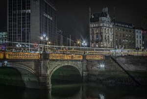
Andy Sheridan ( he of the wonderful long exposure urban portraits) twasks:
Anyone else think that that Heineken sign [at O’connell Street Bridge] should be replaced with something less…beery? #Dublin #Ireland #moneytalks #visuallandscape
Well?
Meanwhile…
@Hippoclides @jnrbaker @broadsheet_ie @Dublin_ie @DublinTown @DubCityCouncil @dubcityarc @dubcivictrust @CiaranCuffe @journal_ie There was a harp on it once — a Guinness harp — and, for a time, it was even known coloquially as "Harp House". The Heineken sign shld go.
— Frank McDonald (@frankmcdonald60) April 20, 2017
Sponsored Link


Your Ma.
Yeah, and the Baileys sign on the quays should go too.
Ads happen.
No
Guinness half-strength?
absolutely not! That sign has been there for decades and is a part of the landscape! and there’s a bar underneath it, do you want to replace that with something less beery, too? maybe another Carrolls?
No, a Dealz should go in there. Frank McDonald has little to think about
I’d say get rid of all ads.
https://www.theguardian.com/cities/2015/aug/11/can-cities-kick-ads-ban-urban-billboards
Replace it with something artistic.
used to say Sony!
He who pays decides. If you have the funds get it changed. Otherwise put up with it!
God I’d love a pint. Not Heino though.. Guinness man me!
‘The Bord Gais Energy Theatre’ and ‘The Aviva Statdium’
Gick.
You’re obviously not paying enough taxes , step it up.
Gack
Take it all! I don’t need money.
Neon ads are all over Japan
If anyone has been to Osaka / Nara you can’t see the structures behind them
of all sorts
ages & vintages
etc
I don’t see what the problem is in a City landscape
Downtown Caherciveen is another story
Get a life man. I think you were expecting some righteous hand wringing here weren’t you ?
Like I said get a life….
Calm down there.
guy is just asking a question, you fupping willy
He’s right though, yer man was 100% expecting some outrage
He’s wrong and you are wrong. He was just asking a question.
Yes, the #moneytalks hashtag clearly denotes an innocent question and lack of an agenda.
“Agenda” :D Seems like you’re the outraged one, dear.
No jpg link Moyest?
Indeed.
If one owned the cityscape, hell yes. One doesn’t though.
I think that I shall never see
A billboard lovely as a tree.
Perhaps, unless the billboards fall,
I’ll never see a tree at all.
I quite like the Bulmers Christmas tree one with the real lights in it.
I think it looks better without the Heineken sign. Cleaner.
It’s a subjective thing though.
Why photoshop out “Heineken”, but leave the star?
photoshop…..for people who can’t accept reality!
Communist propaganda.
Because the star is enough to hurtle passers-by into a fit of wanton and unbridled desire for cheap, mediocre Dutch lager.
It’s mediocre, alright. It’s not that cheap though. I’ll take a Guinness, thanks.
I dunno it’s kinda retro
And It’s not like it’s hiding an attractive building to start with
a birra oul art would be good there instead.
It needs to be bigger…spell out HEINEKEN with 1 letter on each building going down the quays…now that’s advertising!!
Is that crappy nokia ad still there at bridge end of O’Connell St?
It’s always Heineken. They changed it from all caps to make the letter e look like a smile.
FACT! I did the tour.
Had a quick read about those smiling e’s…very interesting indeed.
Also, the star’s five points represent water, barley, hops, yeast and the magic of the brewer.
I think I’ve that right. They were fairly generous with the freebies and it’s quite a few years ago.
Not the star of Bethlehem, no? Hehe
no, they kept the hands but it says something else now
Commercial concerns aside, It looks better with the logo.
Pushers Out
Heineken schmeineken.
I’ve no opinion I just wanted to say Heineken schmeineken.
A DUBLIN sign, like the TORONTO sign at Toronto City Hall.
for when you are wasted and can’t remember where you are ?
Heh.
DUBLIN? WHAAAAAAAAAAAAT? NO WAY!
“There was a harp on it once — a Guinness harp — and, for a time, it was even known coloquially as “Harp House”.”
In ye olde times there was also a pub there called “The Harp”.
They should relocate the “why go bald sign?” to there.
Someone must be scarleh for leaving the light on for the whole floor