
 Sinn Féin
 Labour

Direct Democracy Ireland

Green Party

Social Democrats
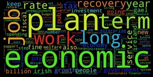 Fine Gael

Fianna Fáil
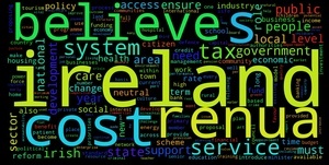
Renua
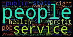
People Before profit
FIGHT!
Grainne Faller writes:
Researchers at the Insight Centre for Data Analytics a Science Foundation Ireland funded project bringing together 400 data researchers across the country] have taken all nine party manifestos and, using text analysis, have created a single graphic for each, based on the most frequently used words.
The largest word in each word cloud is the most frequently used. In some cases, like the Green Party, the word is intuitive: green. In others, like Fianna Fáil, less so: service.
The manifesto-crunching exercise is part of the Insight4Elections project [involving a team of researchers University College Dublin and Dublin City University]
Tomorrow the Insight Centre will launch a complete web service for the voter, journalist or candidate who wants to keep a close eye on Twitter trends related to each candidate, their key issues or their newspaper coverage.
For months researchers at the Insight Centre for Data Analytics have watched the engagement of all GE16 candidates, tracking growth in their follower numbers and activity on their Twitter pages.
Using text analysis tools developed by Insight, researchers are tracking key election issues as they emerge on the social networking platform.
Insight Centre for Data Analytics
Meanwhile…

Leaders’ debate wordcloud
By Annie West
Interesting project, looks like fun.
You could easily make up a gif that flashed those images in such a fast way that they made people looking at them physically sick.
Or you could leave them as they are…
‘You could easily make up a gif that flashed those images in such a fast way that they made people looking at them physically sick.
Or you could leave them as they are…’
-That wasn’t ME.
“Service Ireland” Sounds like what FF were doing for years all right.
Hmm.. that isn’t a great way to present data as it seems to make the most-frequently-used word large enough fit to width of the image. So the 4-letter ‘work’ in Labour is a much bigger font size that the 8-letter ‘economic’ of Fine Gael – so it jumps out more.
The second problem with these word (which is a corollary of the first) is that when font-size is used consistently across images for equivalent level words, then shorter words end up looking smaller that longer words.
The third problem is that it isn’t easy to compare the order across images – what are the top 10 words used by each? The top 5 is relatively easy – but what are the next 5 most common words?
And the data seems a bit dodgy. Why is RENUA a valid search term for Renua but the party names aren’t for the others?
I downloaded the Fine Geal manifesto and ‘Fine Gael’ appears 482 times (excluding headers/footers); ‘Plan’ 176 times, ‘Economic’ 110 times, ‘Economy’ 81 times…
Then there are common words not in the image: ‘Ireland’ 255 time
I downloaded the Fianna Fail manifesto and ‘Fianna Fail’ appears 77 times.
Seems a bit unfailr…
Feed it into Wordle, see if you get the same.
In some cases, like the Green Party, the word is intuitive: green. In others, like Fianna Fáil, less so: service. Where is this information?