


From top: Minister for Finance and Public Expenditure & Reform Paschal Donohoe TD at a Budget 2018 press briefing; Michael Taft
The Revenue Commissioners have produced some interesting data relating to incomes over the period of the recession and the beginning of the recovery. What’s noteworthy is the reversal of fortunes between low/average and top income earners in these two periods. There are some caveats in the data.
First, Revenue income data includes those with occupational incomes which are taxable. So the following data includes more than just those at work
Second, incomes do not include contributions to pension schemes; therefore, this is likely to understate incomes at the higher end.
Third, this counts cases, not individuals. This is important when it comes to ‘married’ cases where there are two earners but only counted as one tax case.
Keeping these caveats in mind let’s see what stories the data may be telling us.

Over the period of recession and stagnation, median incomes (the point at which 50 percent earn above and below) increased while the incomes at the top declined – for the top 0.1 percent, quite substantially.
We should note that the rise in median incomes doesn’t mean that all or most received income increases. This could include the compositional effect whereby people lost their jobs, changing the make-up of the group we are measuring.
For those at the higher incomes, the decline was due primarily to the self-employed (property-related?). The EU Survey of Income and Living Conditions shows that employee (PAYE) income rose between 2007 and 2012; however, self-employed income fell by nearly two-thirds.
The story changes, however, when the recovery set in. Between 2012 and 2015, median income fell marginally by 1 percent. However, the top 10 percent saw incomes rise by 2.1 percent while the top 1 percent and top 0.1 percent experienced income increases of 3.6 and 6.8 percent respectively.
Other Revenue data confirms this trend.
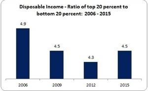
Prior to the crash, the top 20 percent earned 4.9 times that of the bottom 20 percent. This fell during the recession but started rising with the recovery. This is consistent with the data above.
While Revenue shows rising inequality among income tax payers, there is other data that shows inequality falling.
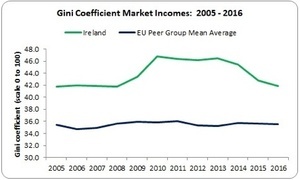
This Gini coefficient measurement refers to market incomes (before social transfers) and covers the entire population, not just those in work; the higher the number, the higher the inequality. We see Ireland returning to pre-crash levels; and in contrast to Revenue, inequality has fallen since 2013.
We should note, though, that Irish market inequality remains substantially higher than our peer group. Indeed, it is the highest in the entire EU, not just our peer group.
Returning to pre-crash levels is not enough from an equality perspective. And if the trends identified in the Revenue data persist, Ireland’s Gini coefficient could start to turn north.
Three policy responses (among many) are needed to address in-work in equality:
First, collective bargaining: there are indications that sectors with high levels of collective bargaining rise to the average of our peer group (along with those sectors where there is high labour demand such as the ICT sector). However, those sectors with low bargaining coverage and union density fall well behind. Collective bargaining – especially in the large domestic sectors such as retail and hospitality – would boost wages and working conditions and make a substantial contribution to closing the inequality gap.
Second, increase the social wage – that is, employers’ social insurance and introduce new in-work innovations such as pay-related sick pay and pay-related maternity benefit. We are an outlier by not linking social benefits with income. This, again, would boost low/average incomes especially as many high-income earners already benefit from workplace schemes designed to protect incomes.
Thirdly, limit precarious contracts by not only facilitating collective bargaining across sectors, but introducing minimum requirements regarding certainty of working hours, temporary contracts and, specifically, public sector and public agencies’ outsourcing.
We shouldn’t always think that inequality is about taxation and social transfers (though there is that). The inequality that flows from the workplace must be addressed in the workplace. And we can do this without resorting to fiscal space gymnastics.
But the benefits – in terms of increased tax revenue (though higher wages) and higher consumer demand (through social benefits and certain working hours) – shows that reducing inequality can be a win-win win situation; for the workers, the Exchequer and domestic businesses reliant on the spending power of workers.
Michael Taft is a researcher for SIPTU and author of the political economy blog, Notes on the Front. His column appears here every Tuesday


When talking about the rich and very rich, the Revenue data is the only reliable data source. This new research is very useful.
The SILC approach is fine for people at the middle and bottom of the distribution. But high-earners have very volatile incomes and it is very hard to catch these reliably. The SILC sample is about 5,000 which means that you will only catch 50 households in the top 1% of income. These 50 will probably have much more volatile incomes from year to year than any other cohort.
Their incomes are likely to be much harder to assess (capital gains, investment income) than people who mainly have employee income.
Finally, people at the very top and bottom of the income distribution are probably the most likely to lie about their income:D
Thanks for that FC… on the higher/lower earners extremes, would the fact that it is across a number of years of the recession/after as opposed to just a single year give it more weight?
Maybe…
‘it’ being the sample size/method
Both the revenue data and the SILC approach make year on year comparisons.
There are conceptual differences.
Revenue analysis includes EVERY tax unit in every year. Everyone who pays tax.
SILC is a carefully-weighted sample of about 5,000 households which CHANGES every year.
Both approaches have strengths and weaknesses. SILC catches non-taxed income (welfare, small self employment) but as discussed it is hard for it to capture the dynamics for very high earners. SILC tells you all sorts of other interesting things about the household (number of kids, work patterns, etc) that Revenue don’t ask you.
It is dangerous to rely too much on the SILC. Some social policy analysts refer only ever to SILC and never reference complementary indicators like consumption, earnings or Revenue data.
Fact Checker – that is an important point re: understatement of high incomes. I understand that Eurostat is aware of this problem and tries to correct for this but there are considerable difficulties. At the end of the day, there is no single dataset or stat that can provide the final answer. We must connect the dots and interpret – which, of course (and to my mind, quite rightly) leads to debate.
Thanks Michael. This Revenue research adds a huge amount to the debate.
Gabriel Zucman has some research (which I haven’t read) which says that you have to augment survey data with actual data on flows from national accounts.
This is the only way to catch income of the super-super-rich, maybe the top 0.01%.
Gini coefficient – https://en.m.wikipedia.org/wiki/Gini_coefficient – for anyone like myself needing a prompt :)
Remember – this value for Ireland is before social transfers. When social transfers are included our Net GINI coefficient becomes slightly above average 0.32 Vs 0.31:
OECD’s Government at a Glance 2017 (Ireland):
In Ireland government plays a very strong role in the redistribution of income Governments fund the provision of goods and services to citizens, but also play a key redistributive role between different groups through the provision of tax benefits and transfers. The difference in income inequality between before and after taxes and transfers, as measured by the Gini coefficient, was the highest among OECD countries in Ireland, the Gini coefficient of disposable income before taxes and transfers was relatively high 0.58 in 2013, yet it fell to 0.31 after taxes and transfers are included. Meanwhile, on average across all OECD countries, the Gini coefficient fell from 0.48 to 0.32 when taxes and transfers are taken into account.
https://www.oecd.org/gov/gov-at-a-glance-2017-ireland.pdf
The pre-tax inequality numbers are important, but remember that the ‘natural’ income distribution will look unusually unequal in Ireland for a few reasons:
-Loads of MNCs mean that high-skilled people get US wages
-Low-skilled people generally work for small, Irish-owned firms which have low productivity and pay low wages
-People without employment tend to live with other people without employment. Jobless household rates are very high.
-What is known as the ‘income effect’ – the high-skilled probably work more hours to compensate for the high marginal rates they have to pay
Another way of looking at that data is the between 2007 and 2015
Median income increased by 2.2%
Top 10% income increased by 1.3%
Top 1% income dropped by 2.6%
Top 0.1% income dropped by 13.6%
I think, when available, the 2015-2018 data will look very nice for the top 1%.
Cian – that is a valid way to look at the data. But the point is to find trends. Hopefully, the 2016 data will be out soon. Then we can see if the trend is holding or telling us something different.
The period of 2012 and 2015 was a period of significant turmoil in the labour market. Unemployment in 2012 was over 15%. By 2015 it had fallen, but only to over 9%.
It is now 5.3%.
If you were not paying tax, then you would not be counted in this.
Given that, I would be doubtful as to how much can be read into figures from a period of such flux. For example, the fall in median income in 2012 to 2015 is probably a function of more people coming into the tax net, albeit at lower income points, than an actual fall in incomes for people.
TheOpposition – that is a valid point. Unfortunately, we don’t have as detailed information on compositional changes (though the Revenue document I linked to has data on income mobility). The CSO showed that up to two years ago weekly income for managers and professionals were growing relatively well while white and blue collar workers’ income was stagnant. In the last two years, all groupings are now growing at the same rate. It’s always frustrating that we can’t get real-time data – however, ICTU’s tracking of CEO pay is worth noting. It has risen substantially. Could the same market forces driving this be driving other high-income groups? We’ll have to wait and see.
It is also worth noting that most of the people in the Top 10%, the Top 1% and the Top 0.1% changed over this period.
Indeed if you were in the top 0.1% in 2006, you were three times more likely to fall out of it over the next decade than to remain in it.
Finally, I would assume that joint assessment is more likely in middle class families, skewing this significantly.
The nine-year survival rate for the top 0.1% is actually 22%.
Remember only one tax unit in a thousand is in the top 0.1%. You need gross income of well over half a million euros to be there.
I would have thought that the number remaining in the top 0.1% for that long is actually quite high.
Two things:
1. The top 0.1% is only about 2000 people/households. Falling out of the top 0.1% may mean that you are still in the top 4000 – but crucially not the very top.
If you look at the rates for 1% [20,000 people/households] it is 60% chance of falling out; and for top 10% it is 54%
2. The richest people (90% percentile) hit their peak income at age 50 (~€110K)… by age 60 they have dropped to ~€92K; so falling out of the top group may be related to ageing rather than anything else.
Great comments, teasing out the piece. Thanks Michael for starting this conversation :)