
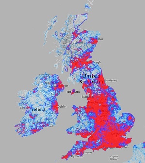


STRAVA‘s real time Google-driven Global Heatmap data visualisation thingie – apparently showing the relative popularity of cycling (pix 1, 2, 3 and bottom right) and running/walking routes (pix 4, 5 and bottom left) around the world.
Explore it in scrollable depth here.
(H/T: Mark Geary)
Sponsored Link