

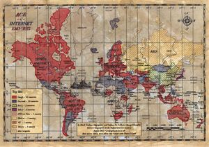
“Two researchers, [former Trinity College lecturer] Mark Graham and Stefano De Stabbata, at the Oxford Internet Institute, have depicted the world’s “Internet empires” in a map, above. The map shows each nation’s most popular website, with the size of nations altered to reflect the number of Internet users there.”
“The map makes for a brief, informative look at how geographic—and universal—certain web tastes and habits are.”
They also created this old timey map-style, below:
Gnarly.
Previously: Twitter Hate In The USA
Age of Internet Empires: One Map With Each Country’s Favorite Website (The Atlantic)