FG plus FF trend pretty clear in latest poll of polls from @mmarsh_tcd https://t.co/epT0uqP5RT pic.twitter.com/HsO14AbwOH
— Dr Kevin Cunningham (@kevcunningham) October 3, 2017
FFiGht!
Sponsored Link

FG plus FF trend pretty clear in latest poll of polls from @mmarsh_tcd https://t.co/epT0uqP5RT pic.twitter.com/HsO14AbwOH
— Dr Kevin Cunningham (@kevcunningham) October 3, 2017
FFiGht!
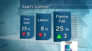


Which colour is which party?
what every colour their vulture fund masters tell them to use
Blue = FG
Purple = FF
and these use the right-hand axis. So FG started at 38%, now down to 31%; FF started at 15% now up to 26%;
Thick green line is the FF + FG and uses the left-hand axis. So FF + FG started at 53% and are now at 57%
this is a poo poo graph style. Yer man should be taken out the back and told off.
P’ah, that’s not what I said:
Yer man should be taken out the back and told off with extreme prejudice.
McBain, tell this man off..
2 cheeks of the same botty-boo, pooping all over the irish people
Most cheery news, dearies. Most grateful.
I don’t belong here.
Be less of a creep
This is the worst graph I have ever seen and imparts zero information due to the its confusing and unlabeled nature
yeah, i bet you keep a notebook and everything.
I’ve never seen him without a moleskine
It’s like something from a 1990s website or maybe an overlay of all the Pong games from the 1980s. Is this what Dr. Cunningham can offer in 2017?
The data sounds like it would be interesting, perhaps someone could put it in an actually useful graph? This is confusing, unlabeled, and possibly uses colours that make no sense.
It says it’s pretty clear, so I believe him.