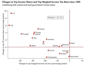
 A graph mapping the income gains of the top 1 percent in several countries, including Ireland, against the tax breaks most of them have gotten since 1960.
The higher the dot, the more income inequality has grown in that country.
…One thing you’ll notice in this chart is that, typically, the bigger the tax cuts given to the 1 percent (the horizontal scale on the chart), the bigger the income inequality.This is consistent with other studies that have shown the tax code has a big effect on income distribution.
The U.S. Has The Worst Income Inequality In The Developed World, Thanks To Wall Street: Study (Huffington Post)
Thanks Blueswannabe

