Came across some OECD stats for perceptions of safety while walking alone.
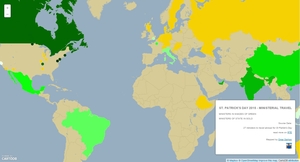
So me, being me, created a map: Interactive version here. As usual you can follow me on twitter or Tumblr…
…love your maps Omar but you need more colours…you could try your local TD.
Major Thrill
Yeah, either my eyes are going or the safe end of the spectrum is black and the danger end is black with a hint of green.
bisted
‘…it was the best of times, it was the worst of times’.
Talismania!
Yep, I usually like your maps but your best and worst are almost indistiguishable.
Sinabhfuil
Deffo. In fact, why isn’t there an agreed spectrum among mappers and statisticians, with, say, light colours as “less-so” and dark as “more-so”, or green as “less-so” to red as “more-so”?
Small Wonder
They often use “heat maps” using all the colours of the ‘bow. It’s an assault on the eyes too.
Spaghetti Hoop
…love your maps Omar but isn’t this subjective data? I mean, a nervous person might not feel safe walking alone anywhere whereas a streetwise person with a good pair of docs, a pepper spray and a spiked umbrella would feel invincible, no?
Lu
Yes, which is probably why they asked more than one person in each country ( I assume, I’m too lazy to go and read the methodology)
Bejayziz
+1 have to agree, after living in Korea and Japan among other countries, Korea has to be one of the safest countries on the planet, wouldnt trust this data tbh. The previous “homework one was the same” which ranked irish kids as having more homework than korean kids, with experience teaching extensively in both ireland and korea I can promise you that this is BS, Korean kids get a scary amount of homework as well as extra classes, they often dont get home until 8 or 9 at night and then its onto a couple of hours of additional work….great maps all the same, just not sure about the data
ZeligIsJaded
Tell that to the two guys who fell through the ground after getting off a bus.
Do not walk in Korea. I repeat, do not walk in Korea!!
Custo
Colours are too samey imo
Dark = good & Dark = bad
Soundings
Yep, it’s too much like placing the coffee jug and the liquidised faeces sample jug side by side in that Austin Powers movie – an accident waiting to happen. Crunchy!
jjberry
Glad i’m not the only one. At first I thought Russians felt the safest walking home.
Digs
The John Moynes of info maps.
Formerly known as @ireland.com
Thanks for the maps. I have to agree with the closeness of the colours/lack of obviousness of the meaning of the colours messages.
I would like to have a map contrasting the above perceptions with the actual safety levels.
Mr. T.
Poo map. Lower and upper ends look almost the same.
You’ld be surprised the amount of people who think that maps just ain’t necessary!
When you tell people you are looking for a GIS position they generally just give you a funny look and are bemused that it’s an actual thing.
But I’m applying everywhere so fingers crossed.
Anne
Best of luck Omar.
Soundings
In all seriousness Omar, good luck, your maps are always entertaining and informative and you obviously have a nose for clarifying information with maps, though on this one occasion, the colouring might have been clearer for some of us.
madouveh on the dole
oh good, im not as comically colour blind as I thought I was. so we’re all in agreement? black for feeling very safe and a slightly different shade of black for extreme danger?
Well I’ve certainly made a boo-boo of the colours on this, It’s a classic combination of me having hawk-like vision that enables me to distinguish shades from over 25 kilometres, and my Samsung screen that likes to display colours differently from every angle.
anyway, I reworked the colours.
Here’s a link to the updated static map. and the updated interactive map.
Thanks for the feedback everyone.
With regards to peoples issues with the data. The map isn’t showing crime/danger levels it is showing the perception of crime and danger. That’s the point of a map. It’s about how safe people feel, not how safe they are…






…love your maps Omar but you need more colours…you could try your local TD.
Yeah, either my eyes are going or the safe end of the spectrum is black and the danger end is black with a hint of green.
‘…it was the best of times, it was the worst of times’.
Yep, I usually like your maps but your best and worst are almost indistiguishable.
Deffo. In fact, why isn’t there an agreed spectrum among mappers and statisticians, with, say, light colours as “less-so” and dark as “more-so”, or green as “less-so” to red as “more-so”?
They often use “heat maps” using all the colours of the ‘bow. It’s an assault on the eyes too.
…love your maps Omar but isn’t this subjective data? I mean, a nervous person might not feel safe walking alone anywhere whereas a streetwise person with a good pair of docs, a pepper spray and a spiked umbrella would feel invincible, no?
Yes, which is probably why they asked more than one person in each country ( I assume, I’m too lazy to go and read the methodology)
+1 have to agree, after living in Korea and Japan among other countries, Korea has to be one of the safest countries on the planet, wouldnt trust this data tbh. The previous “homework one was the same” which ranked irish kids as having more homework than korean kids, with experience teaching extensively in both ireland and korea I can promise you that this is BS, Korean kids get a scary amount of homework as well as extra classes, they often dont get home until 8 or 9 at night and then its onto a couple of hours of additional work….great maps all the same, just not sure about the data
Tell that to the two guys who fell through the ground after getting off a bus.
Do not walk in Korea. I repeat, do not walk in Korea!!
Colours are too samey imo
Dark = good & Dark = bad
Yep, it’s too much like placing the coffee jug and the liquidised faeces sample jug side by side in that Austin Powers movie – an accident waiting to happen. Crunchy!
Glad i’m not the only one. At first I thought Russians felt the safest walking home.
The John Moynes of info maps.
Thanks for the maps. I have to agree with the closeness of the colours/lack of obviousness of the meaning of the colours messages.
I would like to have a map contrasting the above perceptions with the actual safety levels.
Poo map. Lower and upper ends look almost the same.
Why is Omar out of work again?
You’ld be surprised the amount of people who think that maps just ain’t necessary!
When you tell people you are looking for a GIS position they generally just give you a funny look and are bemused that it’s an actual thing.
But I’m applying everywhere so fingers crossed.
Best of luck Omar.
In all seriousness Omar, good luck, your maps are always entertaining and informative and you obviously have a nose for clarifying information with maps, though on this one occasion, the colouring might have been clearer for some of us.
oh good, im not as comically colour blind as I thought I was. so we’re all in agreement? black for feeling very safe and a slightly different shade of black for extreme danger?
Well I’ve certainly made a boo-boo of the colours on this, It’s a classic combination of me having hawk-like vision that enables me to distinguish shades from over 25 kilometres, and my Samsung screen that likes to display colours differently from every angle.
anyway, I reworked the colours.
Here’s a link to the updated static map. and the updated interactive map.
Thanks for the feedback everyone.
ah, you’re very good Omar. Cheers.
whoopsy, this is the link to the updated interactive map.
so .. dark colour means feelin safe?
With regards to peoples issues with the data. The map isn’t showing crime/danger levels it is showing the perception of crime and danger. That’s the point of a map. It’s about how safe people feel, not how safe they are…