Animating the Mercator projection to the true size of each country in relation to all the others.
Focusing on a single country helps to see effect best.#dataviz #maps #GIS #projectionmapping #mapping pic.twitter.com/clpCiluS1z
— Neil Kaye (@neilrkaye) October 12, 2018
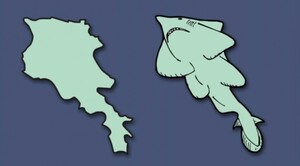
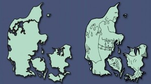
Data scientist Neil Kaye shows how the ubiquitous Mercator Projection distorts the real scale of countries (dark blue = actual size in the map above).
The visualisation shows land masses nearer the Poles [including our own] to be much larger than they actually are.
Take aways: Mercator Alaska is larger than Mexico (it’s not). Mercator Russia is ridiculously exaggerated (it is). Africa is very large indeed.